Kawhi Leonard #NBAVote
It’s the last day of voting for the starting squads of this season’s All-Star teams, and based on the most recent returns released by the NBA, Kawhi Leonard trails Draymond Green for the last starting spot in the West’s frontcourt. Whether through fan vote or coach’s decision, Leonard and Green will both make the team, the former’s stellar campaign for designation as league’s second best player an undeniably deserving trait, the latter’s propensity for booger eating somehow not grounds for disqualification.
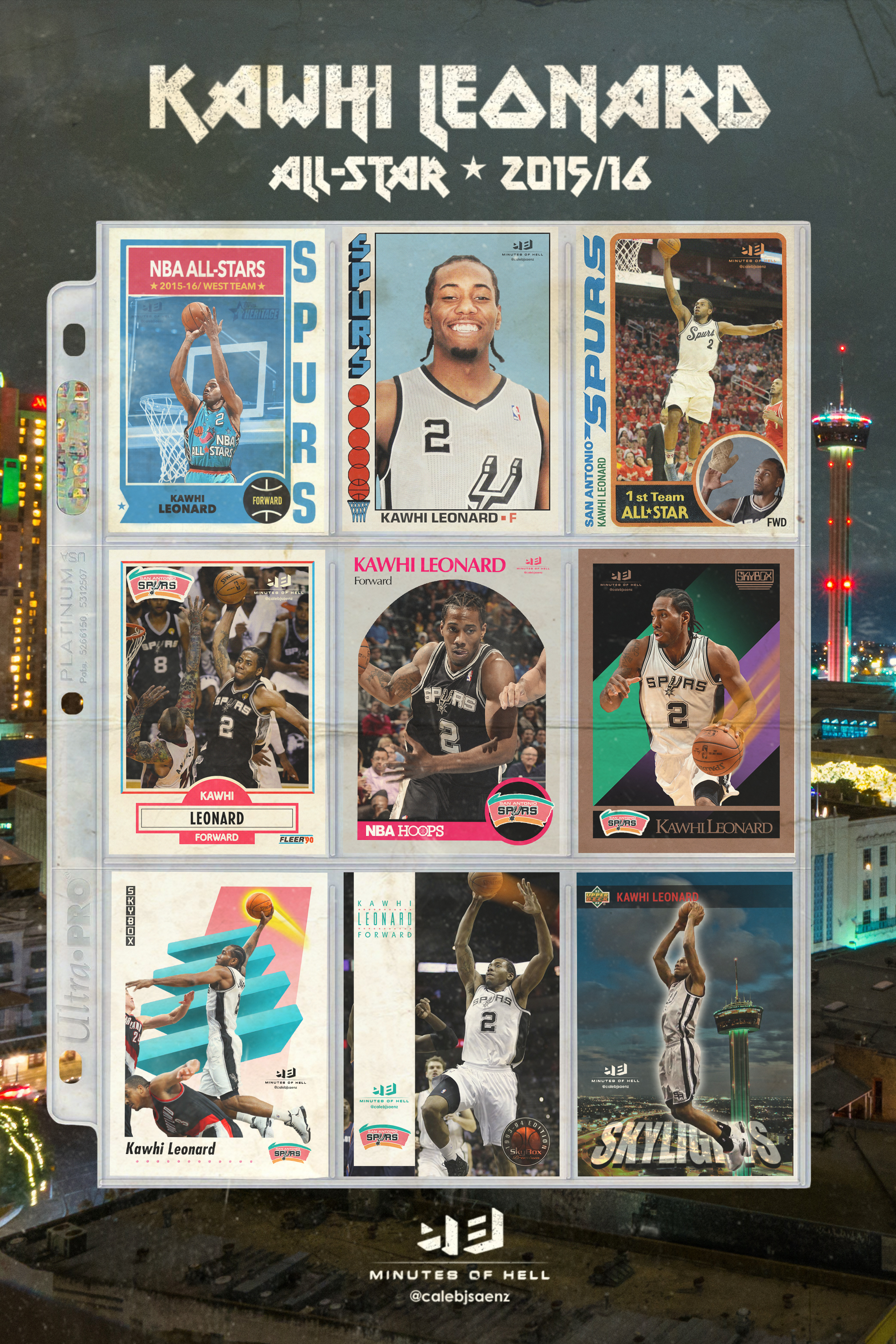
In an effort to help Kawhi Leonard’s case for starting, I’ve created an #NBAVote campaign placing him in classic basketball cards. So far, the cards I’ve tweeted out have generated over 4,000 votes through retweets and sharing. The voting continues until midnight tonight, so we’re giving everybody a chance to save the cards and share them to keep the voting going. I’m also giving references below on the history of each card design. If you’d like to share these pictures or this page, you can download them by clicking the card, but please remember to add a “Kawhi Leonard #NBAVote” to your post. It’s been a long time since we’ve seen braids in the All-Star game. With your help, we can fix that.
***
Topps, 1974 / Topps, 2001
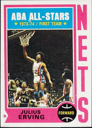
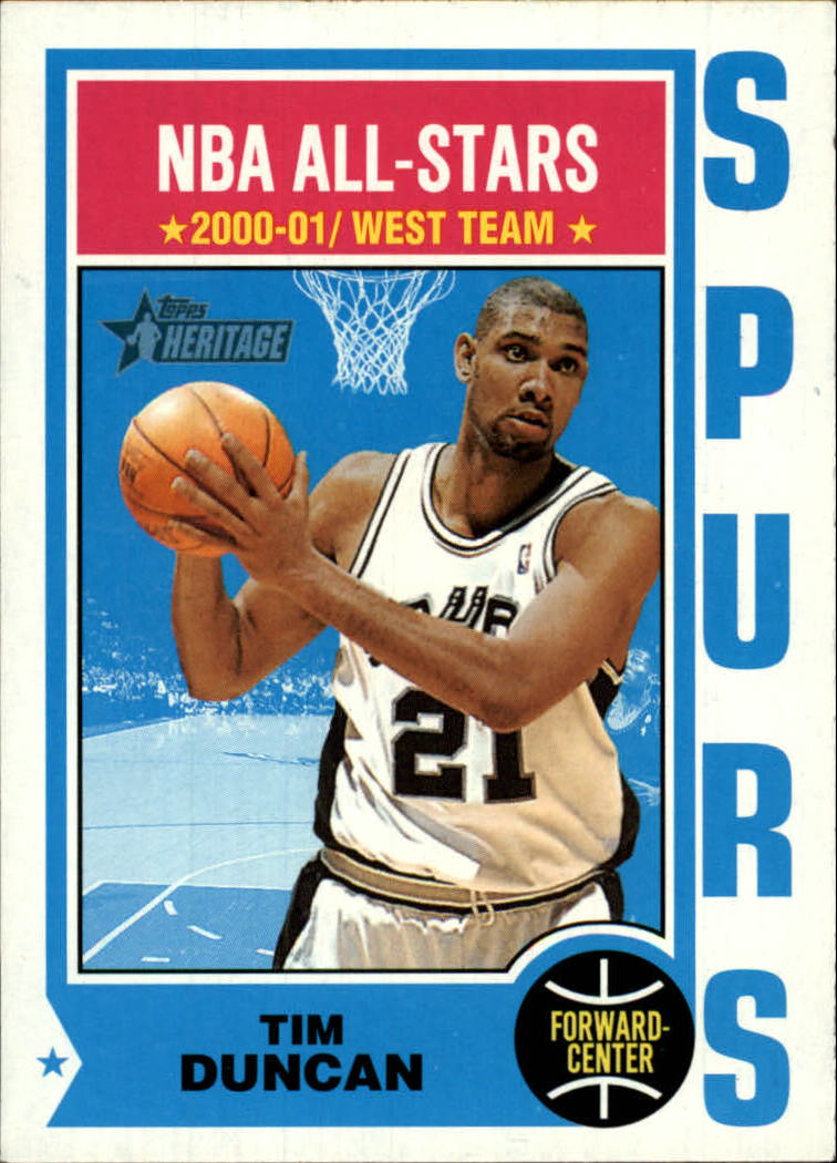
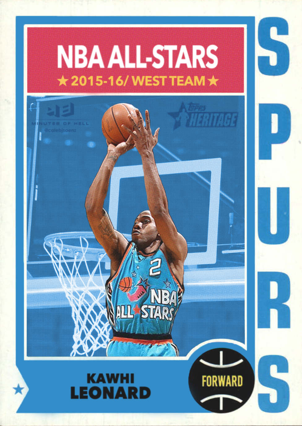
The old 70s Topps designs were simple but clean, and the 1974 edition, pictured here with Julius Erving, was the first that really caught my eye when designing these. In 2001, Topps released “Heritage” editions of the cards, where they put current All-Stars into the classic designs. What’s hilarious to me is that the tribute design is now fifteen years old, and the guy on that one is still playing in the league. For Kawhi’s edition, I decided to put him in the 1996 All-Star game jersey (which was, of course, hosted in San Antonio). For picture resolution reasons, I had to put him in an East jersey, but since it’s Michael Jordan’s, I think you can forgive me.
***
Topps, 1976
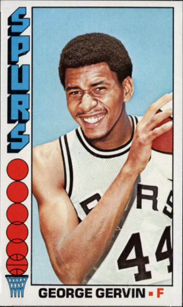
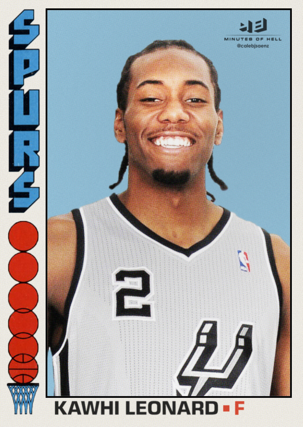
Topps kept it going in 1976, with a simpler but also more lighthearted design. Players were featured smiling on their cards to give a more personable touch. George Gervin’s big grin made for a classic card. It also made for a tough search looking for a picture of Kawhi smiling and looking at a camera. So, no, that smile wasn’t Photoshopped.
***
Topps, 1978
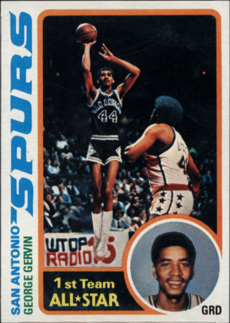
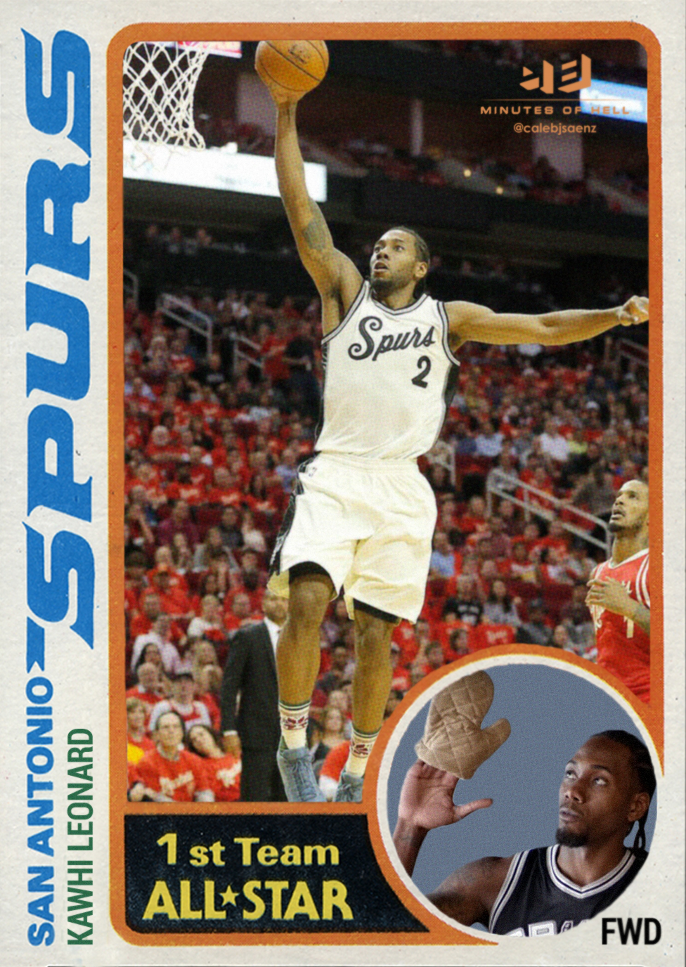 This design is, in my opinion, the last great card design of the 70s and the only good one to be released for over a decade. (The 80s were a weird time for, like, everybody.) Topps continued the large, vertical team name placement but incorporated some elements from the 1974 and 1976 designs above, so card buyers got an action shot and a glamor shot. Here’s Kawhi flying in this year’s Christmas unis and looking at an oven mitt.
***
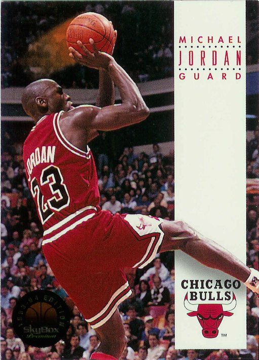
Fleer, 1990
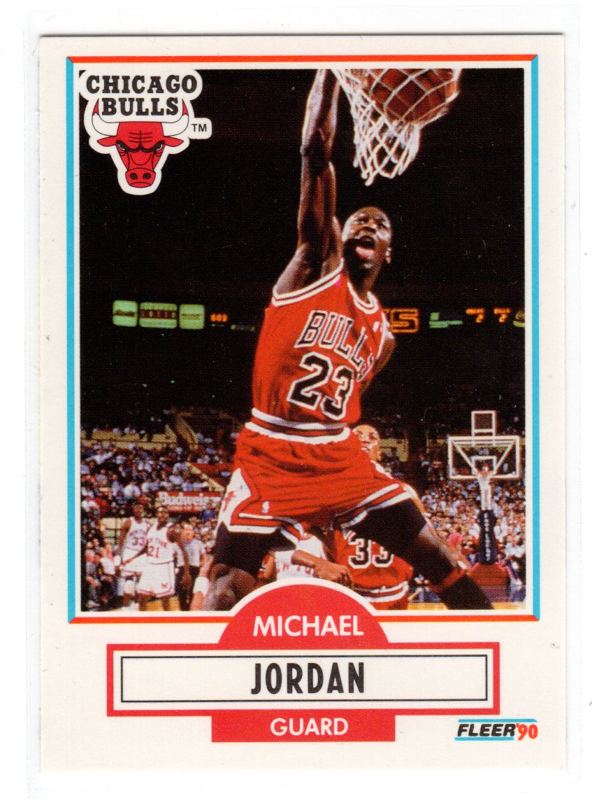
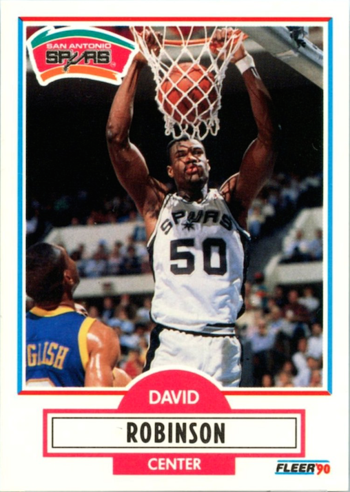
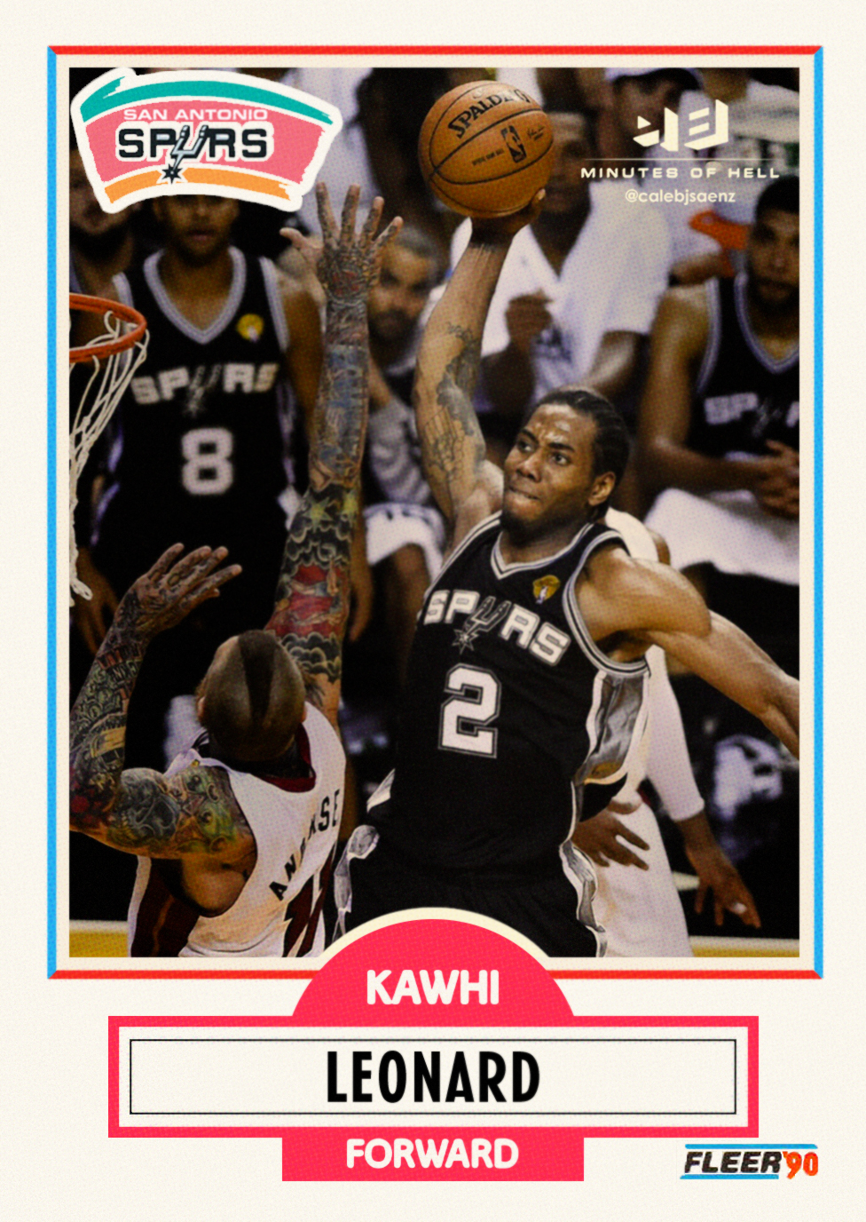
The best basketball cards feature somebody dunkin’ on fools, and this made nearly every Michael Jordan card a classic. Fleer rescued card buyers from the doldrums of the 80s and helped kickstart the 90s basketball card boom with this sleek design. The Jordan yam is the money card, but David Robinson’s was pretty sweet, too. (Yes, I know. Kawhi missed that dunk and was not charged with the murder of Chris Andersen. But the picture was too good to leave out, and honestly, how many of you actually remember the dunks featured on any of these other cards?)
***
NBA Hoops, 1990
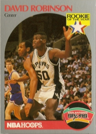
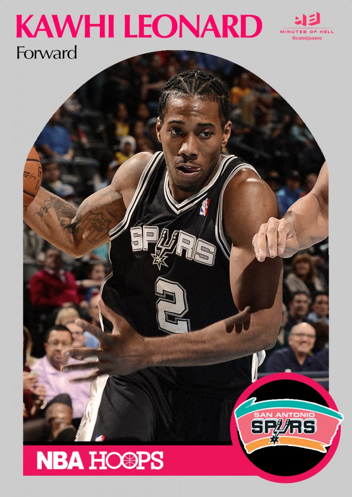
Okay, now we’re on a roll. This NBAHoops design is surprisingly iconic. Somehow a card built around the drabness of a bland gray (or silver, as intended) arch looks so fresh two decades later. It’s an instantly recognizable design despite being kind of boring. But you still remember your favorites, like David Robinson’s Rookie of the Year card. It’s not exactly an action shot, so I went with a simple picture of Kawhi driving to fit in with that year’s aesthetic.
***
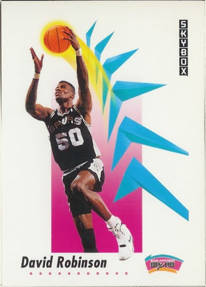
Skybox, 1990
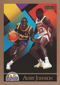
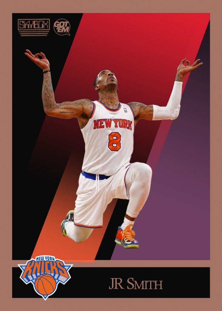
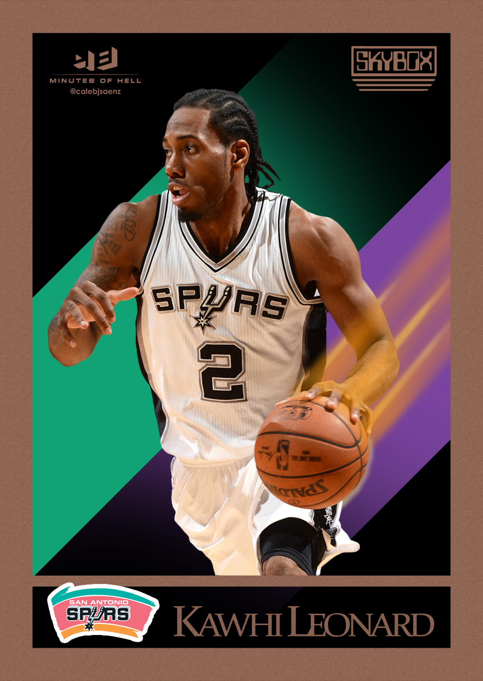
If I were rolling these out as rankings, and not chronologically, I’d probably put this design at the top. It’s just… perfect. It’s definitely a product of its era, with the insane neon streaks and shapes and the gaudy gold frame, but it endures because it provided the league’s personalities with flair and shine without camping up the design. It’s basically the matured version of the 1978 Topps design above. This was the first design I considered for this project because for a lot of us, just hearing “basketball cards” brings these to mind. For reference, I’ve included a disturbing card featuring Avery Johnson in a Denver Nuggets jersey and a hilarious JR Smith tribute from Got ‘Em Coach from a few years ago.
***
Skybox, 1992
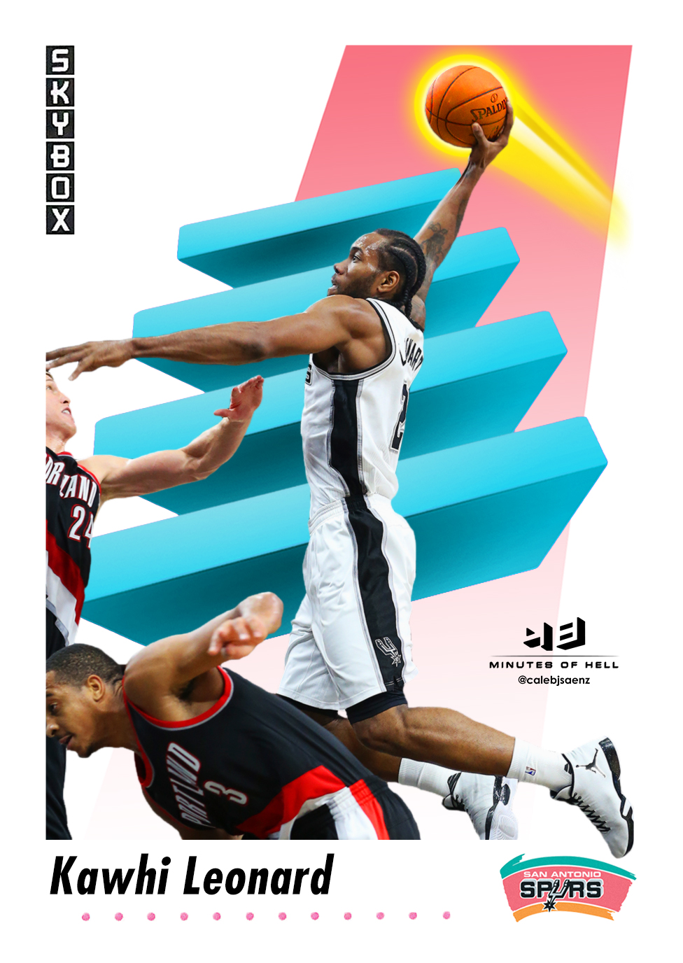 Besides the 1990 Skybox design, this was the most requested on Twitter. It was also the most complicated, but you can definitely tell that by looking at it. This is where all the success of Skybox’s last run gave designers enough money to afford a cocaine habit. The cards in this series featured massive shooting stars, strange alien obelisks, metallic boomerangs, and ominously flowing ribbons of glass. It was the basketball card for the Trapper Keeper age. Sometimes the shapes indicated movement, like in the Robinson card above. Most of the time they just indicated drugs. Speaking of drugs, somebody might want to see what Mason Plumlee was on attempting to block this Kawhi dunk.
***
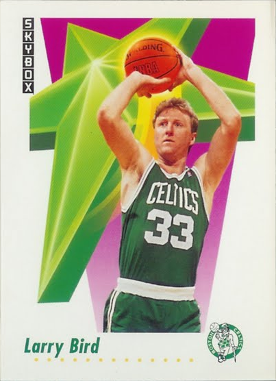
Skybox, 1994
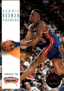
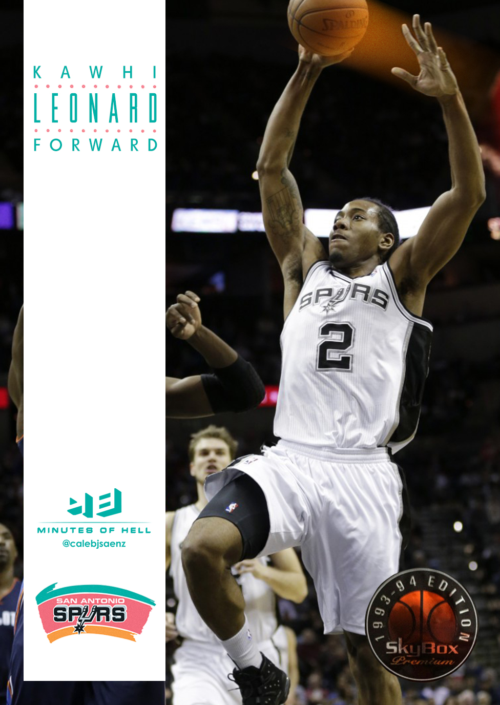
I’ve heard many people refer to this design as “boring,” but I consider it to be one of the better designs presented here. It’s restraint – surely a reaction to 1992’s enjoyable but mad neon vomit approach – has helped it endure. Jordan’s fadeaway card is the most iconic in the set, but the series gifted us many gems, including two Rodman cards, one pre-trade and one post-trade.
***
Upper Deck, 1994
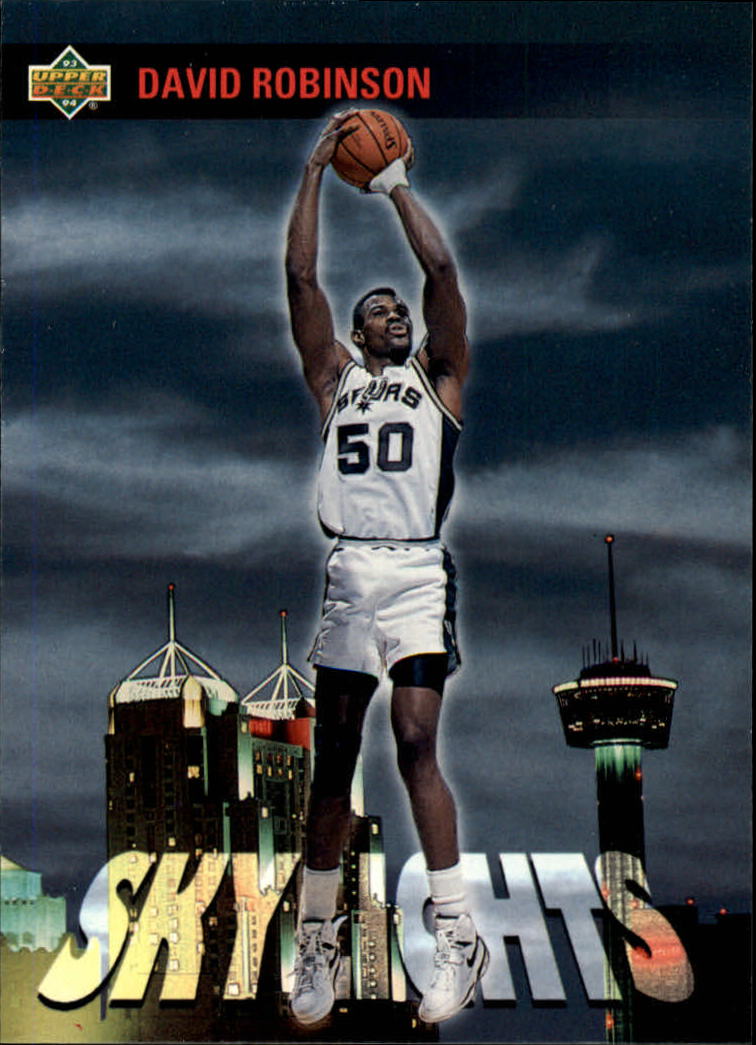
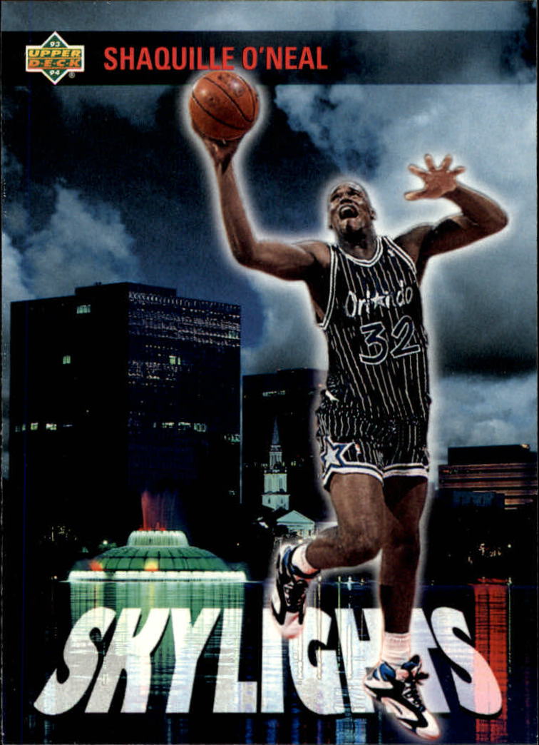
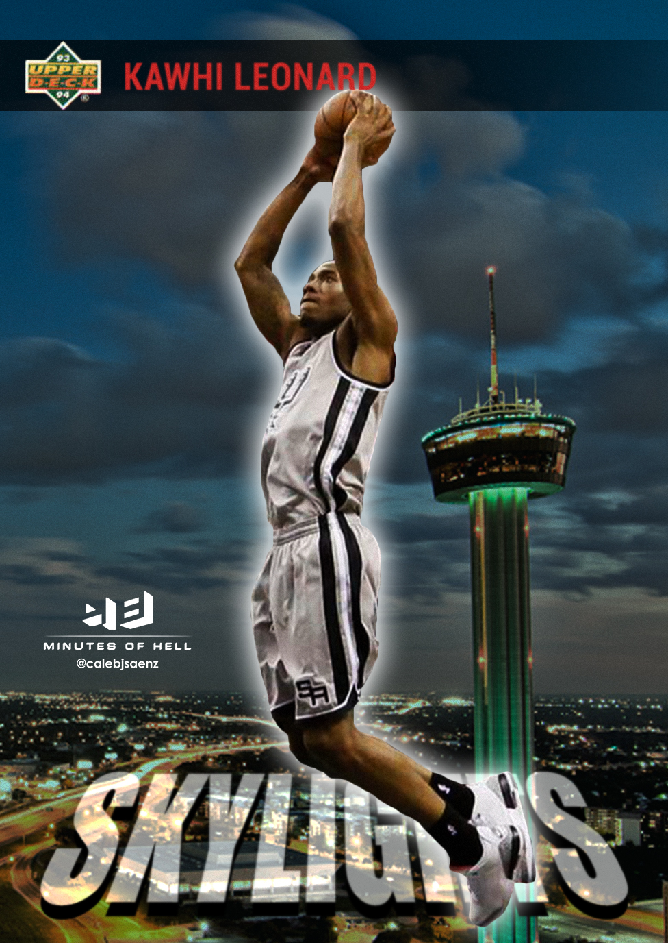
Upper Deck had some excellent designs in the 90s, but the league’s most popular got included in the best of the bunch. 1994’s “Skylights” miniset featured big players standing tall over their team’s respective cities. It was a simple design that avoided excess despite the absurdity of its concept. Some cards, like Robinson’s, were simple and surprisingly elegant. Others, like Shaq’s, provided unintentional comedy. (Seriously, what is he doing there?)
***
BONUS: Fleer, 1961
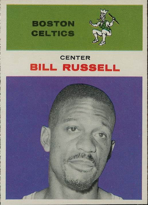
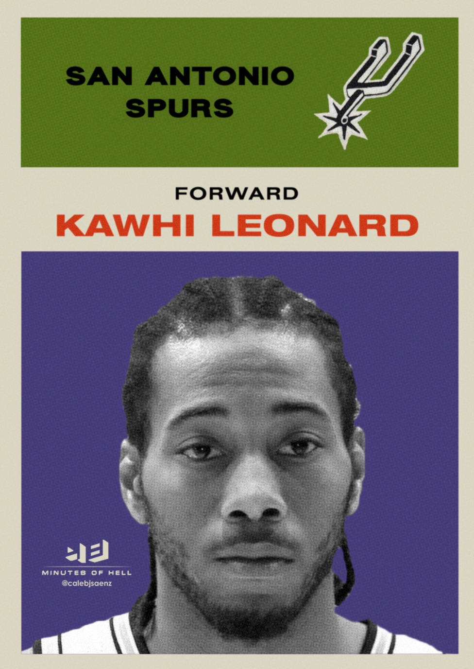
I wanted to include this in the final nine, mostly because Bill Russell’s face in this card is amazing, but the overall design was a little too plain to stand with the others. Still, it was pretty easy to find a picture of Kawhi making the same face, so here you go.